Summary : Promote unusual tourism in Swiss
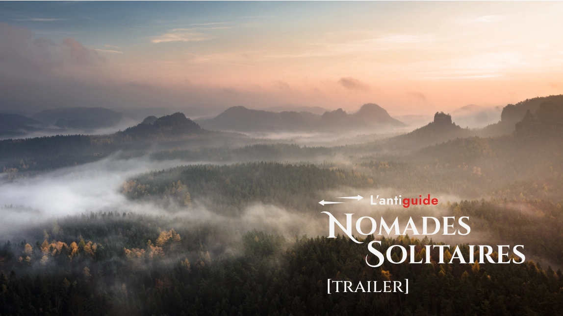
For my apprenticeship diploma project, I had to promote a new unconventional tourism guide, called The Antiguide. Its aim is to provide an alternative to mass tourism by offering various unknown and unusual places to the client, such as hotels, bars, restaurants, walks or even more. After choosing a theme, Enchanted, and receiving the five first places related to it, I had to create a seasonal campaign concept and promote it via a microsite and two videos : a trailer and a pilot episode for a web series.
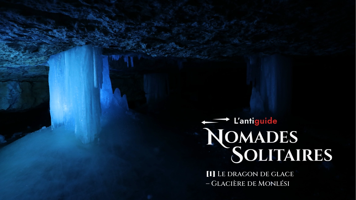
Thus, Nomades Solitaires (Solitary Wanderers) is a web series that accompanies mythical, terrorised, historical, visionary, funny or unknown characters, each linked to the different places proposed by the Antiguide. Like the guide, the theme changes with the season and for the first one, you’ll discover the stories of 6 swiss legendary characters.
Below, you can find the original texts who served to create the first episode’s Ice Dragon legend, the videos and the link to the microsite. (Sorry for the English speakers, everything is only available in french, but you can translate everything with DeepL, it’s quite accurate.)


The web series seasons are half meteorological seasons (Winter, Spring, Summer, Fall), i.e. 6 weeks per seasons. This gives one episode per week, two themes in the web series per meteorological season and 48 locations and stories per year. The season presented here is the beginning part of summer. The trailer is designed for social networks, especially TikTok, and the web series for YouTube and Facebook.
To all travellers on a quest for new fields,
we wish you a warm welcome!


